Saturday, August 17, 2013

Logo Types

Of the billions of logo designs in the world, they all fit into 5 categories: Symbol, Wordmark, Lettermark, Combination Mark and Emblem.  If the logo doesn't match one of these, its probably not a logo.  Keep in mind that many companies actually keep a unified group of logos from different categories and choose the one that best fits each situation.

SYMBOL

Symbols are designs without letters.  Usually the symbols are simple designs.  The Nike "Swoosh" and Apple's "Apple" are prime examples. However, both companies had to build their brands by using their Symbols as part of Combination Marks (defined later).  These brands are now so well known that they can just use their symbol.

Symbols were likely the first logos.  Up until the last century, most people were illiterate.  Writing a business name on a sign was useless.  Instead, you would name it "Falcon Restaurant" and put a painting of a Falcon out front.

WORDMARK

Wordmarks are stylized words.  Disney is one example, your own signature is another.  I suggest that you stop dotting your I's with hearts when you get a real job.  Wordmarks work well with unique names, as long as they aren't too long.

LETTERMARK

Lettermarks are just like Wordmarks, except they only contain initials.  Logos need to be quickly identified so if your company has a long name it is going to make a bad Wordmark.  That is why Hewlett Packard was shortened to HP for their logo.

Like Symbols, Lettermarks seem to be most effective when used in conjunction with a matching Combination Mark (see next).

COMBINATION MARKS

When you place a Symbol near either a Wordmark or Lettermark, you get a Combination Mark.  Most companies with Symbol logos also have a Combination version.  You can see how the Comedy Central logo would also be effective without the words at the bottom, which would leave you with a Lettermark.  When your design has the space, use the larger combination mark so that the audience understands the meaning of the Lettermark when it is used by itself.

EMBLEM

Emblems are drawings with words incorporated into one unit.  The NFL shield is an example.  The line between Emblems and the other logo types can be a bit fuzzy since all of the other logo types become an Emblem by adding more artwork to them.


ASSIGNMENT

Find an example of each type of logo at sites like http://logofaves.com/ or Google Images.  Right click the image and save it to your computer.  Login to your own blog site and upload all 5 logos into a single post.  Be sure to label each type correctly.

Tips for Taking the Right Photos

These tips are for amateurs.  The pros don't follow some of these, and eventually you may not need to either.  If your just starting, these few tips will help you get by until your skills improve.

Take too many pictures.  We're all bound to get lucky once in a while and stick gold with a picture.  You increase your odds by taking more photos.  Its easy to delete the junk, but you can never get back the shot you missed.

Take big pictures.  Zoom out a little and get more in the frame than you need.  You wouldn't hang a picture right against the ceiling, and the subjects of your picture need a little space too.  Go big, its simple to crop the picture down later.  Plus, this gives you the ability to correct the picture if your camera is off level.

Find simple backgrounds.  You want people to see the object you intend them to, not a "Where's Waldo" drawing.  Move left, right, up and down until you can get a simple background.  Sometime you have to lay on the ground to get a blue sky background.

Pay attention to light sources.  If the sun or a light is behind your subject, your subject will appear dark. Move around so the light is at your back if you can.3
3.e shutter button doesn't cause blur.

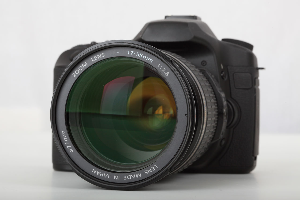
The best camera is the one you have with you.  Don't fret too much about having a DSLR with you at all times.  Most phones have the capability of capturing the essence of any shot.  Maybe the shot won't end up hanging in an art gallery, but at least you got it.  If the shot is going to end up small on a website, the quality probably doesn't matter much anyways.  Of course, a true professional can take a better shot with an iPhone than either of us can with a $5k DSLR.


Extra Links to Improve Your Skills:
http://lifehacker.com/5815742/basics-of-photography-the-complete-guide


Friday, August 16, 2013

Gestalt Theory

Gestalt Theory (Wikipedia) is more of a description of human vision than a true set of rules.  The Theory says that humans perceive the whole before the parts.  

Emergence - Objects close together become one.  

We don't see legs, a tail, a head and fur, rather we see a dog.  It is only later that we see these individual parts if we chose to study the object.
The last time you went to the store, what kind of shoes was the clerk wearing?  You probably don't know, but you know she was wearing shoes.  Your brain handles so much information in a day that it simplifies.  You only would have noticed the unusual (no shoes).

Reification - Visual construction of non-existant objects

Your mind tends to fill in the blanks.  You can imagine the clerk wearing shoes even if you couldn't see them.

This is a popular trend in design right now.  Schilling Bros. Lumber is a great example.  By taking a letter and hanging it off the edge of the design, your mind creates the rest of the "S".

Multi Stability - One image has multiple interpretations

M.C. Escher made a career out of Multi Stability.  The mind will shift between the 2 or more versions of what it sees.  This is not often used in commercial design, but can be used subliminally.

Other famous versions of Multi Stability are the 2 face/vase and the old/young woman.

Invariance - Ability to recognize objects even when they vary

Even if you only saw a red car from the front, your mind can recognize it as the same car when you see it from the side or if it is now white.  Your mind can recognize most familiar objects no matter how they are rotated, skewed, colored, deformed, or even redrawn in a new style.